The Importance of Responsive Web Design for Modern Businesses
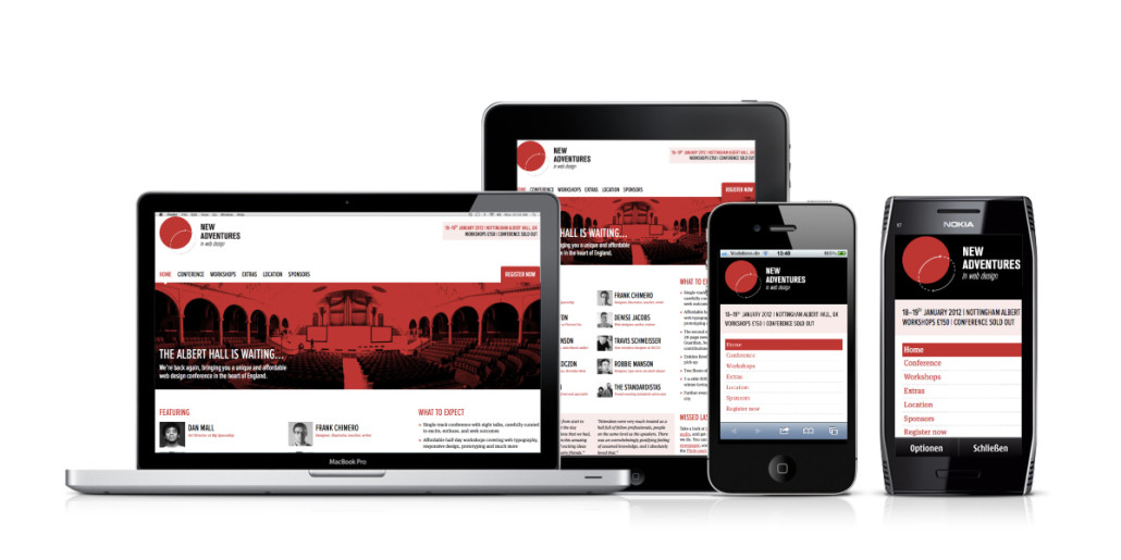
In today's digital landscape, having a responsive web design is crucial for modern businesses. A responsive design ensures that your website adapts seamlessly to different screen sizes, whether it’s a desktop, tablet, or mobile device. This adaptability not only enhances user experience but also improves engagement, ultimately leading to higher conversion rates. With the increasing use of smartphones for browsing, businesses that fail to implement a responsive web design risk alienating a significant portion of their audience.
Furthermore, search engines like Google prioritize responsive websites in their ranking algorithms. A well-structured, responsive site helps boost your SEO efforts by providing a consistent user experience across all devices. This means that not only will users find your content easier to navigate, but search engines will also favor your site over non-responsive competitors. In short, investing in responsive web design is not just about aesthetics; it's a vital strategy for staying competitive in the modern marketplace.
Top 5 Techniques to Master Responsive Web Design
Responsive web design is essential in today's digital landscape, as it ensures your website looks great on any device. Here are the top 5 techniques to master responsive web design:
- Fluid Grids: Use fluid grids for your layout to create a flexible structure that adjusts to different screen sizes. This involves setting widths in percentages rather than fixed pixel values, allowing your design to adapt smoothly.
- Media Queries: Employ media queries in your CSS to apply different styling rules based on the device's characteristics such as width, height, and orientation. This enables you to deliver tailored experiences for desktop, tablet, and mobile users.
- Flexible Images: Ensure your images are responsive by setting their max-width to 100%. This prevents images from overflowing their containers, allowing them to scale correctly on varying screen sizes.
- Viewport Meta Tag: Incorporate the viewport meta tag in your HTML to control how your site's dimensions and scaling are handled on mobile devices. This is a crucial step in ensuring a harmonious experience across all platforms.
- Testing and Iteration: Regularly test your website on various devices and browsers to identify areas for improvement. Responsive web design is an iterative process, so gather feedback and make necessary adjustments.
Is Your Website Mobile-Friendly? A Guide to Responsive Design Best Practices
In today's digital landscape, ensuring your website is mobile-friendly is not just an option; it's a necessity. With over half of global web traffic coming from mobile devices, a responsive design can significantly enhance user experience and boost your search engine rankings. This guide will provide you with essential best practices to create a website that adapitates seamlessly across various screen sizes. Here are some key elements to consider:
- Flexible Layouts: Use fluid grids that resize based on the user’s screen, ensuring a consistent layout.
- Media Queries: Implement CSS techniques to apply different styles based on the device’s characteristics.
- Touch-Friendly Navigation: Ensure buttons and links are easy to tap and navigate, enhancing usability on mobile devices.
Another crucial aspect of ensuring your site is mobile-friendly is optimizing images and content. Large images can slow down page loading times, which negatively affects user experience and SEO. To address this, use responsive images that automatically adjust in size according to the screen they're viewed on. Additionally, keep your content concise and engaging to avoid overwhelming users on smaller devices. Remember, a well-optimized mobile site can reduce bounce rates and drive conversions. Consider following these tips:
- Compress Images: Use tools to minimize file sizes without compromising quality.
- Limit Text Length: Break up content into smaller paragraphs and use bullet points for easier readability.
- Font Size: Ensure text is legible on all devices by choosing appropriate font sizes and styles.